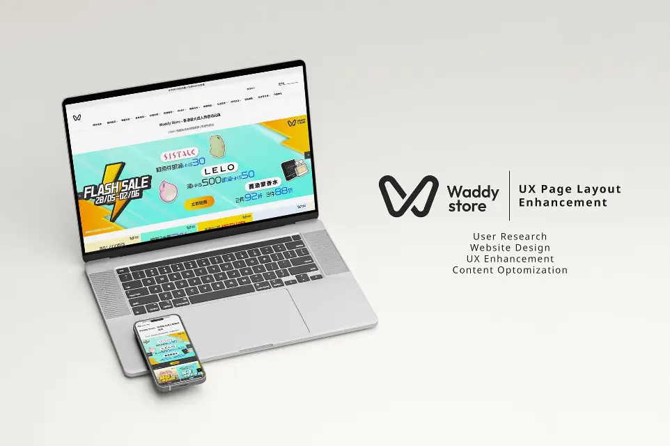
About The Project
Waddy Store Limited is one of the largest e-commerce sex shops in Hong Kong, offering over 5,000 products online. With such a diverse product range, creating an intuitive and engaging user experience becomes crucial for helping customers easily find products they want and need, while also sparking curiosity and providing educational content. Through comprehensive user research, including surveys, user testing, and behavioral analysis, I identified key pain points in the existing site navigation.
As the UX/UI Designer, I led a comprehensive project in collaboration with the marketing and SEO teams to enhance the user experience by strategically updating the layout of the Homepage, Category pages, and Subcategory pages.
Qualitative and Quantitative Data Collection
To develop a comprehensive understanding of the Waddy Store website's user experience, I employed a multi-method research approach that combined qualitative and quantitative data collection techniques. By gathering insights from diverse sources, we could identify key user pain points and opportunities for design improvement.
User Testing
Invite 10 users to do different tasks, obverse how they navigating the website, identifying usability challenges and interaction patterns.
Survey
Collected structured feedback from over 160 customers to quantify satisfaction levels and gather specific insights about website experience.
Heatmap Data
Analyzed user click patterns, scroll behavior, and interaction hotspots to understand how users actually move through and engage with the website.
Interviews
Conducted in-depth conversations with customers to uncover personal motivations, expectations, and emotional responses to the website.
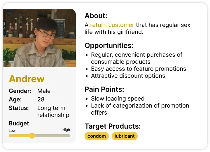
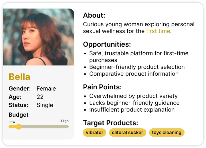
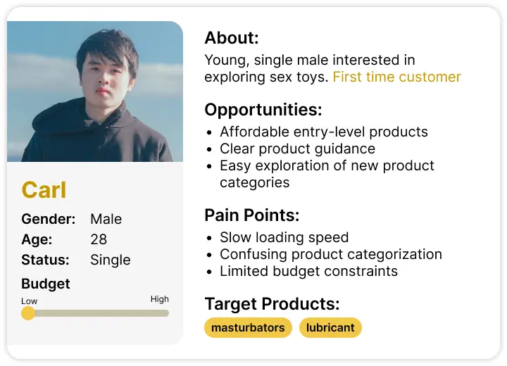
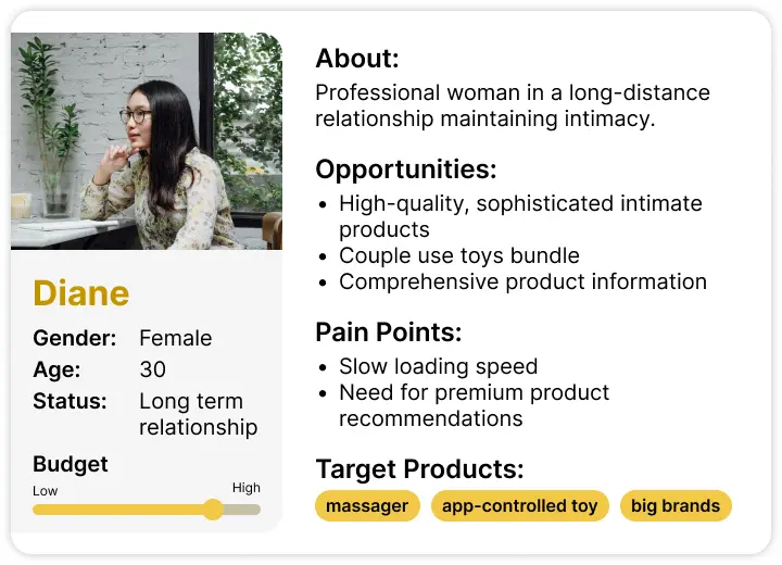
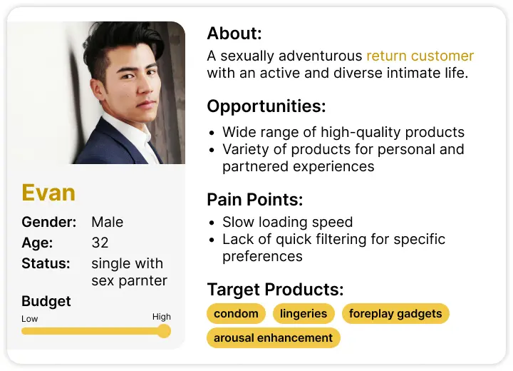
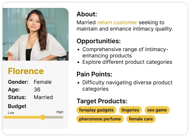
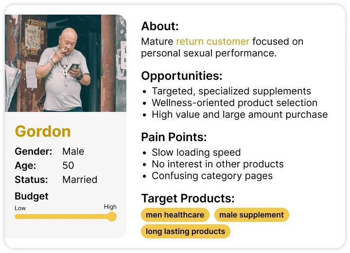
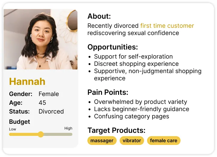
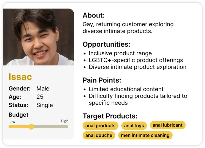
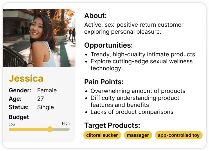
Persona
Waddy Store serves a diverse customer base with complex and varied needs across different age groups and comfort levels. To address this complexity, I developed 10 user personas that mapped out the unique opportunities, preferences, and potential barriers of our different customer segments.
Pain Points of Home Page
Excessive Content Overload
Too much content was cluttered, making it difficult for users to focus on key information. Important promotions and featured products were lost in the noise, causing users to feel confused and quickly leave the site.

Slow Loading Speed
Heavy content slowed down the homepage, leading to long loading times. Users grew frustrated and were more likely to leave the site before it fully loaded, increasing the bounce rate and reducing engagement.
Lack of Clear Focus and Organization
Without a clear content hierarchy, the homepage felt chaotic and disorganized. Users struggled to navigate efficiently, often leaving the page without exploring further due to the absence of clear guidance or calls to action.
Pain points of Category and Sub-category Pages
Inconsistent Layouts
The category pages lacked a standardized template, leading to inconsistent designs that confused users. This inconsistency made navigation unpredictable, prompting users to abandon their browse.
Missing Introductory Content
Many category pages lacked introductory text or descriptions, leaving users without the necessary context. This made it harder to understand the product categories, causing users to leave without engaging further.
Unclear Product Categorization
Products in sub-category pages were grouped inconsistently, making it difficult for users to find specific items. The unclear organization frustrated users, often leading them to exit the site in search of a better experience.
Lack of Descriptive Context
Sub-category pages often lacked detailed descriptions, leaving users to rely only on product images and titles. This lack of information made it harder for users to make informed decisions, prompting them to leave before completing their purchase.
Outcome
The new UI of homepage and template of category and subcategory pages was strategically designed to address the key pain points identified through our comprehensive research.
Thanks for Watching